This report provides a graph in line or bar format of expenses and income. You can track the general trend of expenses and income, or look at trends for specific accounts. Here is how to access the report and set the different options.
- To access the report: From the Checkbook or Contribution screen, click on Reports and then Graph Report.
-
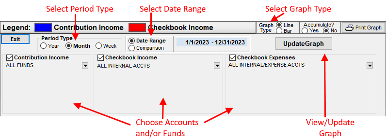
Select a date range for the report: Select either the Date Range or the
Comparison type of graph.
- Date Range: Selecting Date Range allows you to view a graph of all data types (Contribution Income, Checkbook Income and Checkbook Expenses.) Specify a Start and End date by clicking on the dates and selecting a date from the calendar.
- b.) Comparison: This graph shows only one type of data, i.e. Checkbook income, to be selected. It shows one year compared to other year(s). To change the range of years, click the up or down arrows next to the start or end year to change the range.
- Select the data type(s) by clicking the Contributions Income, Checkbook Income and/or Expenses boxes. If Comparison is selected, first unselect the currently selected type and then select a different type.
-
As an option, you can select one or more accounts/funds for each data type:
-
To select a single account or selection of accounts, click the
 button next to the data type. Click on an account or fund. To select more than
one, press and hold down the Control (CTRL) key and then click on each account/fund. To see
data for all accounts, choose the "All" option.
button next to the data type. Click on an account or fund. To select more than
one, press and hold down the Control (CTRL) key and then click on each account/fund. To see
data for all accounts, choose the "All" option. - If multiple accounts/funds selected: Choose the Combine or Itemize options. The combine option graphs all selected accounts as one line/bar on the graph. The itemize option will graph each account/fund as a separate line on the graph.
-
To select a single account or selection of accounts, click the
- Select the Period Type: Chose week, month or year. (Only week and month are available for Date Range option and week is only available on NTS version 4.70 and above.)
- Click the Update Graph button to view the graph.
- To change the graph type from line to a bar graph, click the bar graph option (see illustration below.)
- The Accumulation option will accumulate the data on the graph from one period to the next. Click the YES option to view the accumulation graph.
- To change the colors of the lines or bars, move your mouse over the color in the legend you want to change. Click on the new color from the pop-up box.
- To change the size of line on the a line graph, move the mouse over the color box of the item you want to change. Click the up and/or down arrows to change the size. (Only applies to line graphs.)
- To add or change the Graph Title: Click on the Title in the upper-center area of the screen and type in a new title. To enter a sub-title, press Enter and then type in the sub-title. Press Enter again after entering in the sub-title.
-
To print the Graph, click the
 button. To
print a full page graph, click the Properties button on the Printer selection box and choose
Landscape from the printer options.
button. To
print a full page graph, click the Properties button on the Printer selection box and choose
Landscape from the printer options.
Any of the options can be changed after the graph has been generated. After changing an option, you may need to click the Update Graph button to view the updated graph.